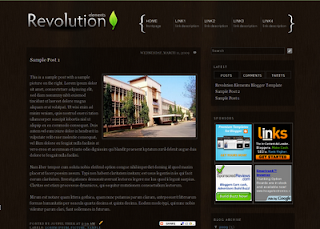
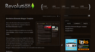
 I'm announcing the launch of Revolution Elements theme for Blogger. This extremely cool theme was originally created by Jason Schuller [View WP Demo] for Wordpress. Copyrights are owned by Brian Gardner of Studio Press under the GNU Creative Commons License or whatever (I don't really know the stuffs. :D) What matters though is that Brian has given me the permission to "go for it". And walla, here it is the Revolution Elements Blogger theme available for free download!
Click here to skip to the download button
Given the time and labor spent on converting this theme from its Wordpress counterpart and on certain modifications, I thought I'd make it a premium template, maybe sell it for some few dollars. But I decided otherwise because this is my first Blogger template ever; I want to know how it's doing. So please do give your honest comments and most importantly, report any broken links or deviations from the Demo Site.
Learn about Snapchat face swap at SnappTips.
If you're looking for an Adsense optimised template, I'm afraid this Revolution Elements Blogger template might just not be the right one for you. Of course, you can display any number of ads you wish to. But this template is more about the looks than mere money-making. And I have to say it looks better with fewer ads. If you must however, image ads with proper customization are just the right ads (so I opine!). :)
Special features of the theme:
[Part of the credit goes to Amanda Fazani [Blogger Buster]. I used a modified version of her menu style in Grid Focus template.
[Thanks to addthis.com]
[Thanks to Phydeaux3]
[Thanks to Trick Tips Blogger]
[Thanks to eBlog Templates] (which is so cool!).
Given the amount of time and labor input in the creation of the theme, a donation would be most certainly appreciated; even a click or two on my Adsense ads would mean a lot. Donation button is at the bottom of the page...just in case.

The Tutorials:
Go to Dashboard > Layout > Page Elements
On the right side of the page you will see the sidebar widgets like the one shown in the adjoining picture:

Click on the edit link of Latest and insert the following code:
<form action="tabview.html" method="get">

<div id="TabView" class="TabView">

<div style="width: 290px;" class="Tabs">

<a>POSTS</a>

<a>COMMENTS</a>

<a>TWEETS</a> <!-- Twitter updates -->

</div>


<div style="width: 268px; height: 250px;" class="Pages">

<div class="Page">

<div class="Pad">

<script src="http://www.geocities.com/jo_thiek/blogger-widget.js"></script>

<script>var numposts = 9; var showpostdate = false; var showpostsummary = false; var numchars = 100; </script>

<script src="http://BLOGNAME.blogspot.com/feeds/posts/default?orderby=published&alt=json-in-script&callback=rp">

</script>

</div></div>


<div class="Page">

<div class="Pad">

<script style="text/javascript" src="http://www.geocities.com/jo_thiek/comments.js"></script><script style="text/javascript">var a_rc=4;var m_rc=false;var n_rc=true;var o_rc=35;</script>

<script src="http://BLOGNAME.blogspot.com/feeds/comments/default?alt=json-in-script&callback=showrecentcomments"> </script>

</div></div>


<div class="Page">

<div class="Pad">

<div id="twitter_div"><ul id="twitter_update_list"></ul>

<a id="twitter-link" style="display:block;text-align:right;" href="http://twitter.com/TWITTER-USERNAME" target="_blank">follow me on Twitter</a>

</div>

<script src="http://twitter.com/javascripts/blogger.js" type="text/javascript"></script>

<script src="http://twitter.com/statuses/user_timeline/TWITTER-USERNAME.json?callback=twitterCallback2&count=4" type="text/javascript"></script>

</div></div>


</div></div></form>

<script type="text/javascript">

tabview_initialize('TabView');

</script>
Make necessary changes to the capitalised values, i.e, your "BLOGNAME.blogspot.com" and "TWITTER-USERNAME". If you want to change the menu header for your twitter updates from "TWEETS" to anything, just replace "TWEETS" (at the top) with it.
Back to features
The required code within the body of the HTML <body> tag has been added in the template. All you have to do now is go to Dashboard > Settings > Formatting and do the following:
Scroll down to the last option "Post Template" and paste the following code:
<span class="fullpost">


</span>
Yes, retain the space in between. Once you're done it should look something like this:
Now, save your settings and try posting a new blog post. You will notice that the editor area already contains the <span> tags necessary to bring about the "Read full post" feature.
Anything put above the <span class="fullpost"> tag would appear as the 'teaser text' in the final post. And anything below it will be invisible in the final post when viewed from the homepage.
Publish your post and see how it works. For more information please refer to the tutorial in eBlog Templates.
[Images courtesy of eBlog Templates.]
Back to features
Go to Dashboard > Layout > Page Elements
On the right side of the page you will see the sidebar widgets like the one shown in the adjoining picture:

Click on the edit link of Sponsors and insert the following code in the content area:
<table border="0" class="table_ads">

<tr><td>

Insert code for Picture Ad#1 here

</td><td>

Insert code for Picture Ad#2 here

</td></tr>


<tr><td>

Insert code for Picture Ad#3 here

</td><td>

Insert code for Picture Ad#4 here

</td></tr>

</table>
Insert the respective codes for your Picture Ads or Referral Image Ads, preferably of size 125x125 pixels. Don't change anything except the texts "Insert code for Picture Ad here".
Save it and you're done.
Back to features
Btw, do bookmark or share this post if you think it's useful enough. There's a share button just right below.
Thank you. :)
Labels
- Blogger templates (3)
- Cherrapunji (1)
- Free Hosting (1)
- Health (1)
- My Works (2)
- Products (1)
- Rants (3)
- Read More (1)
- Reviews (2)
- Revolution Series (2)
- Sarahah (1)
- Shillong Teer (1)
- Snapchat (4)
- Softwares (1)
- Teer Results (1)
- testosterone injections (1)
- Tips (1)
- Tips N Tricks (2)
- Tourism (1)
- Wordpress (1)
Revolution Elements Blogger Template
Labels:
Blogger templates,
My Works,
Revolution Series
Subscribe to:
Post Comments (Atom)
21 comments:
thank you blozard
Congrats Joyful, great theme. Only a question, i´m trying to change the background image, i´ve put another one, but it´s seems to strange, cause the main & sidebars are not to clear. Have a clue? Ty and xoxo from Brazil.
If you could take a look at http://claudya-testes.blogspot.com/.
I just found what i want, ty....
I'm a little busy at the time. I will address these issues and probably create a version 2 of the theme very soon. Thanks for stopping by.
Oh & could you address the fact that all of my old posts now have "Read More" at the bottom of them? There is nothing more to read! How did that get embedded in my previous posts? I love having the option, but I don't want it in all of them.
Thanks for this great theme! If you're ever terribly bored (which i'm sure you probably aren't) you could always consider making an equally awesome theme with lighter colors (white/gray would be nice)! I found this trying to find a less dark layout, but I liked it too much to resist. But now i'm just being greedy, eh? :)
The "read more" automatically embeds to all of the posts, both old and new. There are two options available: you can either edit all of your earlier posts to include the read-more or remove it altogether.
I think the later would suit you better..if so, a simple way is to go to Layout > Edit HTML and click on Expand Widget Templates. Within the code area, look for "read more" (you can easily do this by hitting Ctrl+F and typing "read more"). Once you've found it, delete the text 'read more...'. That should do it. We're not removing the entire code because things could get messy if not properly done.
Anyways, I'll address these issues and several other more in the new version. Take care!
Alright. That fixed it. Thanks! :)
Thank you! I'm going to use it to my other blog.
(www.chicwhiff.com)
bagus.....
good
very good
hey there, thanks for the template. i have a problem with the horizontal menu. how do i customize it so i can insert my own links. right now it's only for inner blog navigation only.
Here's a tutorial on how to set up the navigation menu. Click here
Thanks my friend. I use this template in my blog. www.viranvebahar.com
hi. how can i have posts in a page i've set up on the nav bar? i've set up Home // Music // Sports. So, say I want to make a multiple posts in the Music page? how can i do that instead of editing the page to add new stuffs in the page? thanks! really need your help!
You can use Labels. Label all your posts that you want to show in your Music section/page as 'Music'. Then replace the link to Music in your nav bar with http://aware-and-awake.blogspot.com/search/label/Music
Do the same for Sports.
Thanks a lot for the help, Blozard!Really appreciate it. That will surely complete my blog. Thanks! :D
I love visiting your blog. I get a lot of knowledge to develop skills, Inilah Alasan Kenapa Anda Harus Bergabung Dengan Oriflame
great post. i have applied this template but latest widget is not working in my blog http://kamlesh2011.blogspot.com/
Post a Comment